Pollution mortality in Latin America
I was thinking about how pollution levels, and therefore where we live, affect our health so much. (This is discussed in urban studies and related fields through environmental inequality.)
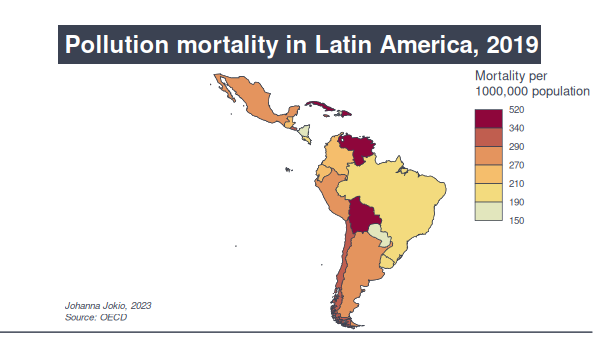
The OECD has a lot of data on health as well as environment indicators at a global scale. The rates of mortality pollution in Latin America recorded for 2019 range from 148 in Paraguay to the highest two: 430 in Venezuela and 516 per 1 million population in Cuba (quite a leap).
I am thinking of making an R Shiny app for a group of indicators for Latin America, and it could be around health and/or the environment. Any ideas, let me know.
Data and more information about the indicator: OECD (2023), Air pollution effects indicator. doi: 10.1787/573e3faf-en (Accessed on 22 June 2023).
For this one, I used mapsf, the successor of the cartogaphy package. I really liked using this one, as the main bit of the code ie. map_choro() incroporates options (palette, number of breaks…) that you would commonly use anyway but maybe have to add in or build up before plotting, which is helpful. I’ll add the code below, as I have some comments on it:
#Load packages
library(tidyverse)
library(dplyr)
library("ggplot2")
library("sf")
library("rnaturalearth")
library("rnaturalearthdata")
library(mapsf)

#Read in data
pollution <- read_csv("pollutioneffectmortality.csv")

#Check the location column and define a list that we can match countries to and filter the data by
unique(pollution$LOCATION)
latam <- c("MEX","ARG","BOL","BRA","COL","CHL" ,"CUB","DOM" ,"ECU","HTI" ,"GTM", "NIC","PER",
           "PRY", "URY"  ,"VEN","CRI","JAM", "SLV")

df <- pollution %>%
  filter(TIME >= "2019") %>%
  filter(LOCATION %in% latam)

#Check the mortality values' range
range(df$Value)

#Get basemap from naturalearth package

world <- ne_countries(scale = "medium", returnclass = "sf")

latamap <- world %>%
  filter(iso_a3 %in% latam) %>%
  select("iso_a3", "name", "admin")

#Merge these together

pollutionmap <- latamap %>%
  left_join(df, by = c("iso_a3" = "LOCATION"))

## Use the mapsf package ###

#Initialise
mf_init(pollutionmap, expandBB = rep(0, 4), theme = 'brutal')

#Plot the base map
mf_map(x = pollutionmap)

# Plot the choropleth map
mf_choro(
  x = pollutionmap, var = "Value",
  pal = "Heat",
  nbreaks = 6,  # here, I decided on the number of breaks after testing a few different ones
  leg_title = "Mortality per\n1000,000 population",
  leg_val_rnd = -1,
  add = TRUE
)

# Plot a title
mf_title("Pollution mortality in Latin America, 2019")

# Plot credits
mf_credits("Johanna Jokio, 2023\nSource: OECD\n") # the Source would sit very close to the horizontal line, hence the linebreak

# Plot a scale bar - I found this strange in the 'brutal' theme, as it just draws a horizontal line rather than showing the scale, and I didn't particularly want the line to stretch over the map
mf_scale(size = 2)