Eurostat map using Python
I’ve started using Python a while ago and I really like using geopandas (for one, the documentation is pretty good).
Using Eurostat data, this is a map comparing tertiary education in European countries in 2022. Tertiary education refers to anything university-level.
First, I’ve used a Natural Earth shapefile to get the base map of the world. Then, after I’ve read in the Eurostat file and made sure the country colunms in both files are called ‘Country’, I merge them like so:
df  = wb.merge(land10, on ='Country', how ='left')
gdf = gpd.GeoDataFrame(df)
A few countries were missing from Eurostat so I coerced them into missing, ‘NaN’ values. The final map was created by the following code:
from mpl_toolkits.axes_grid1 import make_axes_locatable

fig, ax = plt.subplots(1, 1)

divider = make_axes_locatable(ax)

#axes on which to draw the legend in case of color map
cax = divider.append_axes("bottom", size="5%", pad=0.1)

ax.set_axis_off();
gdf.plot(ax=ax,
        column="Percentage",
        cmap= 'YlGn',
        legend=True,
        cax=cax,
        legend_kwds={"label": "Percentage Tertiary Educated", "orientation": "horizontal"},

    )

xmin, ymin, xmax, ymax = gdf[gdf.Country == 'Germany'].total_bounds
pad = 20 # add a padding around the geometry
ax.set_xlim(xmin-pad, xmax+ pad)
ax.set_ylim(ymin-pad, ymax+ pad)

# Figure footer title
fig.text(0.4, 0.9, "Source: Eurostat 2022",
         horizontalalignment="center", fontsize=8)

# Save plot to file
plt.savefig("eurostat.png", dpi=600)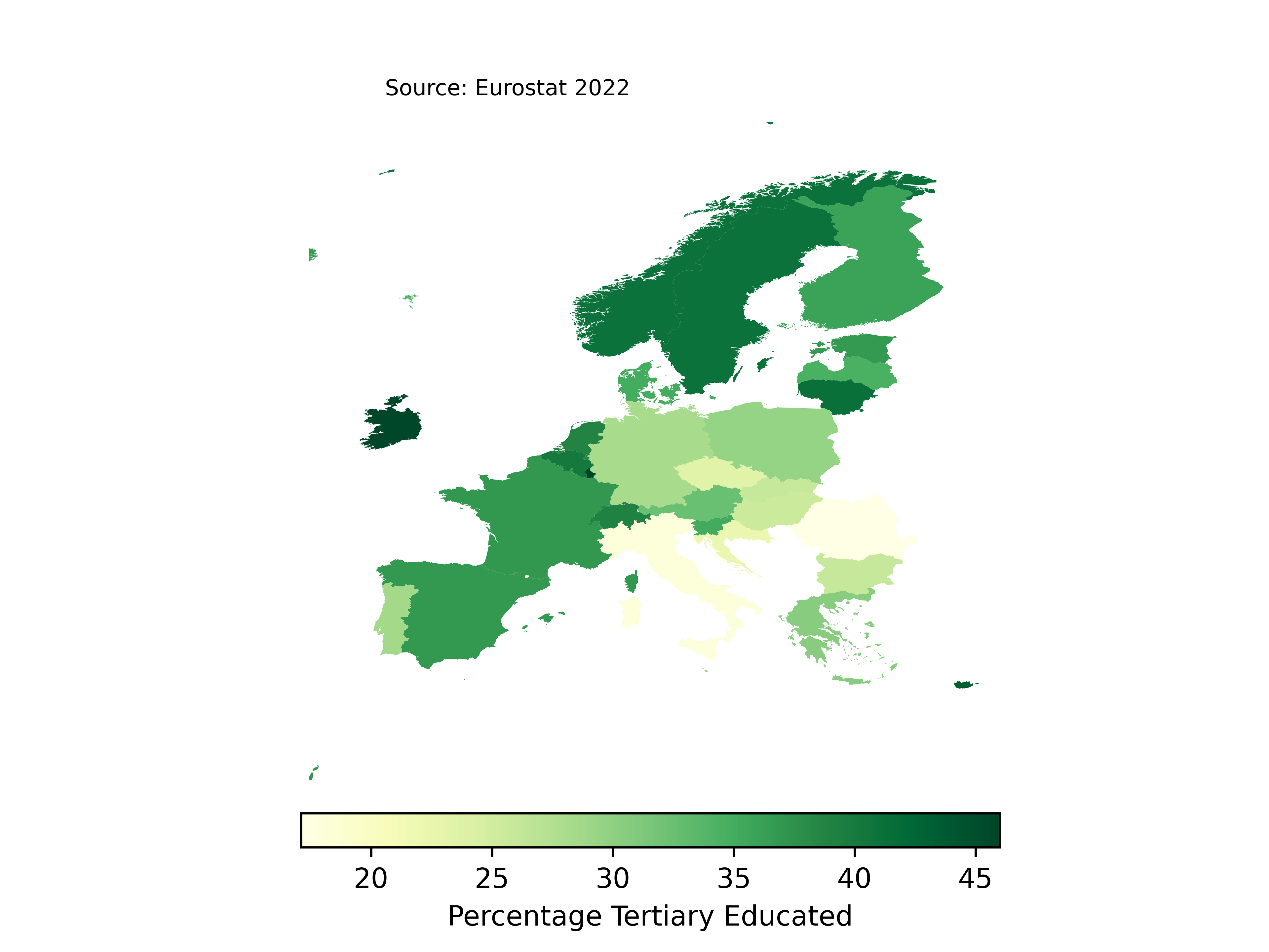
I would like to know how to make the map flat and not so squished (if you know what I mean). I’m going to explore other base maps in the future.
The script is also available in my repo.